Acquisition is expensive. Leaks are fatal.
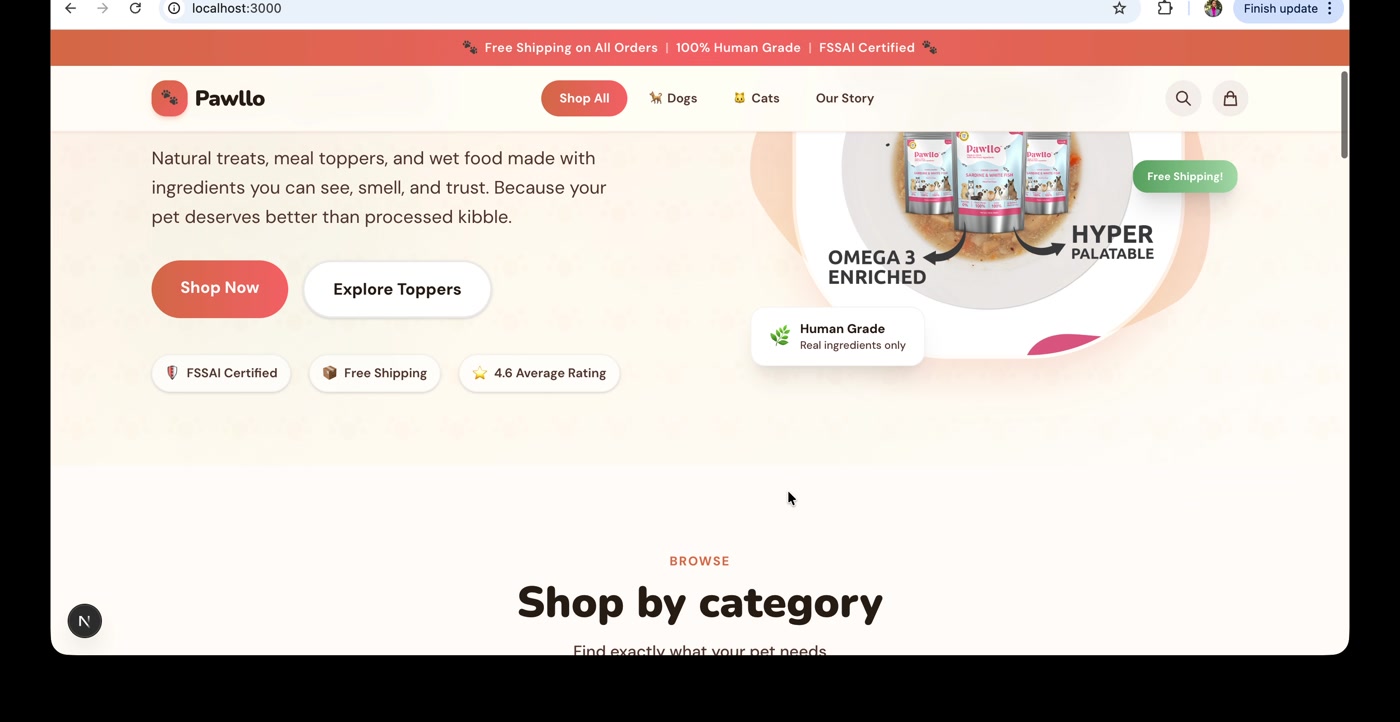
Pawllo is a premium D2C pet brand in India. Small catalogue, smaller ad budget, competing against Amazon, Supertails, HUFT, and Drools. Every visitor is paid for, and most could buy somewhere else.
Pet food is a replenishment category. The unit economics live in the fifth purchase, not the first. A leak in the funnel doesn't cost this transaction. It costs the next ten.
The first question wasn't "what should we test?" It was "what's actually broken?" Until you know what's broken, every test is a guess.
The funnel leaks at every stage.
Five stages, mapped from a first-person walkthrough on desktop and mobile, scored against Nielsen's heuristics, Baymard's e-commerce research, and a 10-competitor benchmark.
| Stage | Estimated leak | Top friction |
|---|---|---|
| Landing → PLP | 60-75% | Six folds of brand copy, broken promo CTA, slow first load |
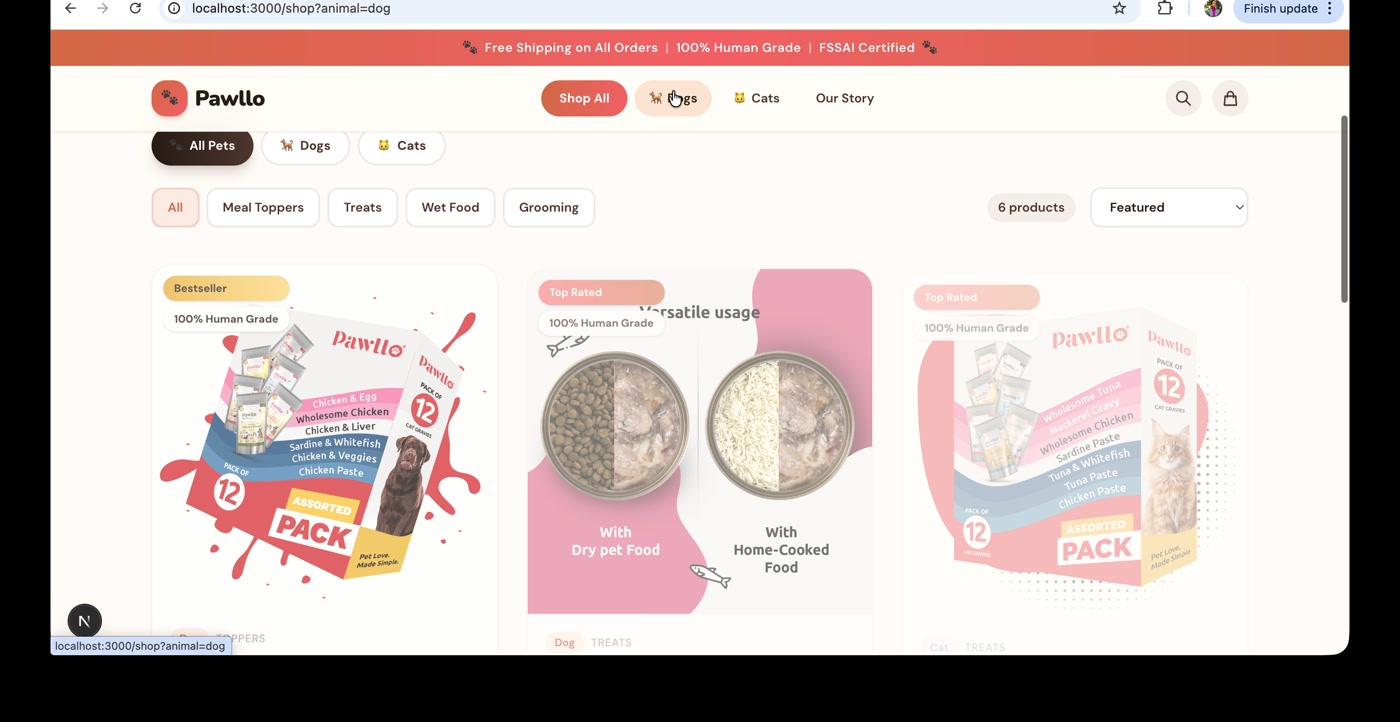
| PLP → PDP | 50-65% | No search, no filters, packaging-only imagery |
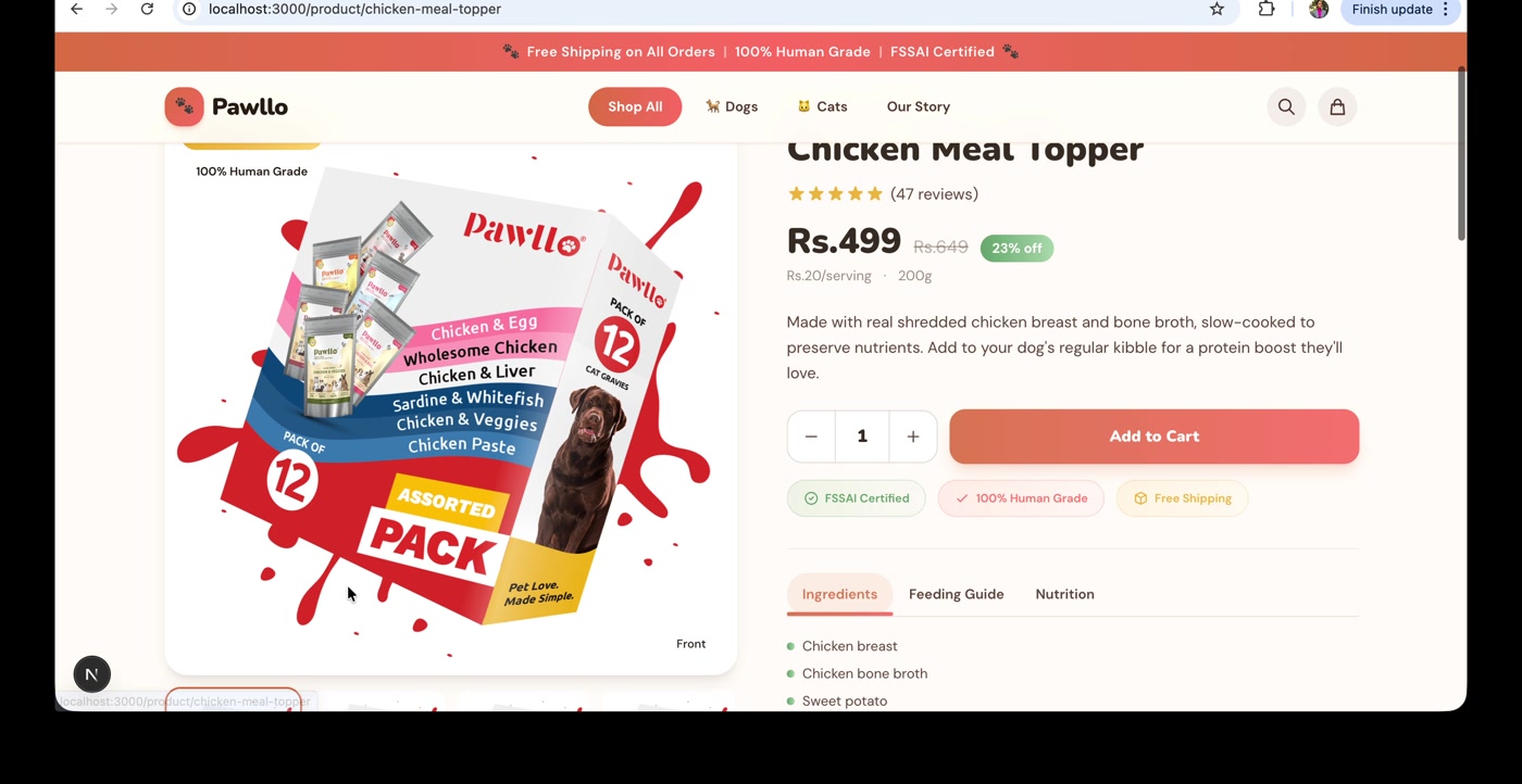
| PDP → ATC | 75-85% | Zero reviews, scroll desync hides gallery, inverted info hierarchy |
| Cart → Order | 65-75% | ATC redirect, hidden payment methods, no trust signals |
| Repeat | Structural | No subscribe-and-save, no Buy Again, no WhatsApp reorder |
On a 27-point UX audit against 10 competitors, Pawllo scored 2.8 out of 10. The competitor average was 7.0.
The leaks weren't symmetrical. Most traced back to features the site never built.
Three tiers. One plan.
Each finding got two inputs: an ICE score for impact, confidence, and effort, and a certainty tag for fix, hypothesis, or experiment.
8 fixes. Bugs and missing table stakes. Known answers; the work was execution.
6 hypotheses. Direction known from research, magnitude unknown. Build with measurement.
5 experiments. Outcomes that could go either way. Run them properly.
ICE ranked within each tier. The tiers did the sequencing. Fixes first.
19 actions, three tiers.
The full plan, then one example per tier.
- Promo CTA wired to wrong page
- ATC redirect
- Mislabelled "Place Order" CTA
- Search on PLP
- Filters on PLP
- Promo code error state
- COD fee transparency
- Shop Now CTA on homepage
- PDP scroll desync
- Lifestyle imagery
- Reviews above the fold on PDPs
- PDP info hierarchy
- Payment method visibility
- Trust signals in cart and checkout
- Per-unit pricing
- Subscribe & Save
- WhatsApp vs email reorder reminders
- Referral program
- Returning customer shortcut
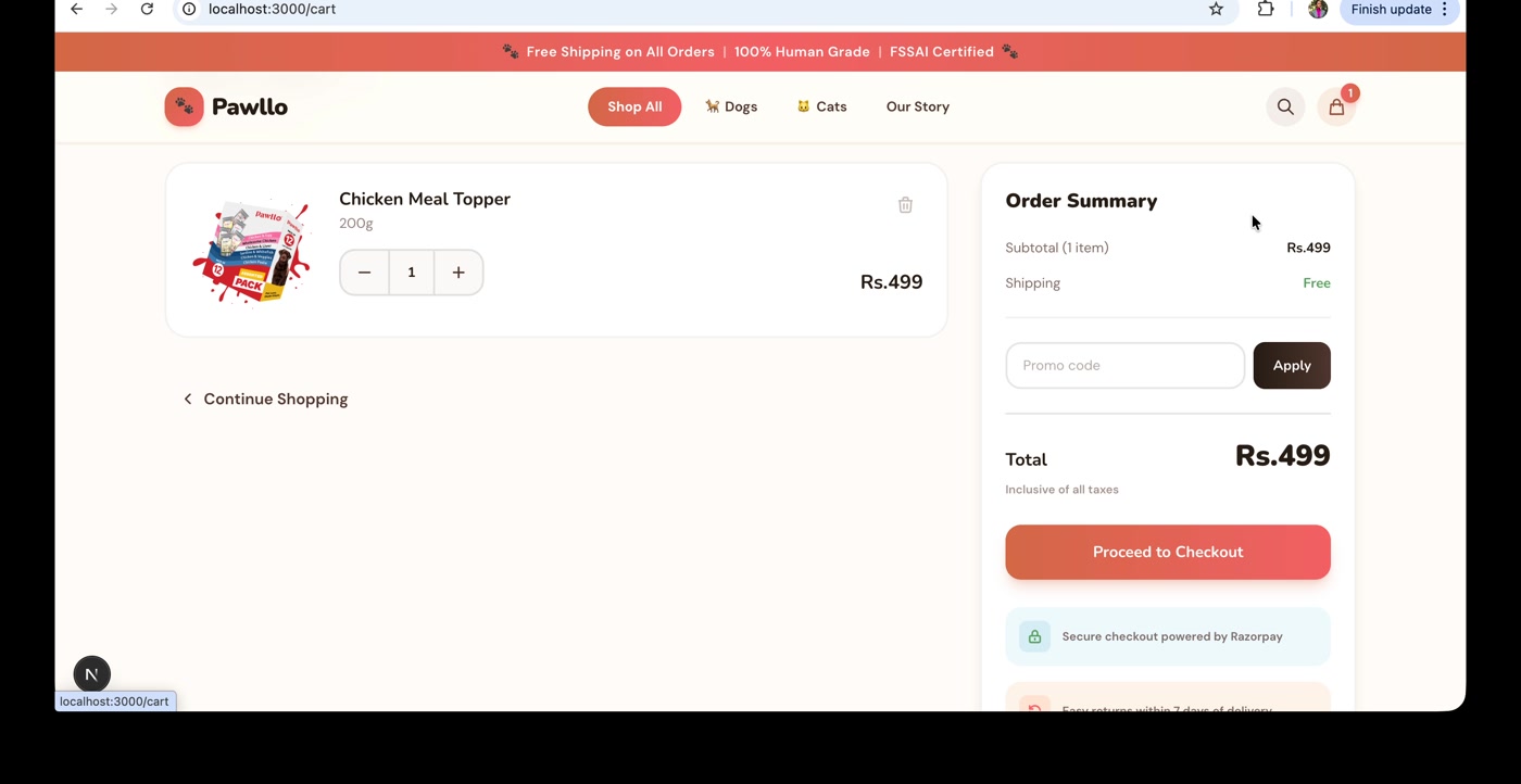
Add to Cart redirect
Clicking Add to Cart routes users to the cart page instead of confirming on the PDP. Multi-product purchasing breaks. AOV drops. ICE: high impact, high confidence, low effort. Confirm on-page, update the cart counter, keep the user shopping.
Reviews above the fold on PDPs
Pawllo has zero reviews. PowerReviews puts the lift from 0 to 1 review at 52%. Direction is clear. Magnitude on a 38-product premium catalogue isn't. Build the review system, instrument it, watch the lift curve as volume grows.
WhatsApp vs email for reorder reminders
WhatsApp open rates dwarf email in India (~98% vs ~20%). But brand-driven WhatsApp can feel intrusive, and a premium brand has tone risk. Random assignment, 60-day window, compare repeat purchase rates.
Different work. Different sequencing. Different success criteria.
Built for first purchase. Sells a daily product.
Pets eat every day. The bag empties on a predictable cycle. The customer needs to reorder. Pawllo's site has no Subscribe & Save. No Buy Again. No WhatsApp reorder. No loyalty program.
A returning customer takes the same five-step journey as a first-timer: homepage, PLP, PDP, ATC redirect, checkout. The site treats them as cold traffic.
Industry data on D2C consumables: 22-44% repeat purchase rate. Subscription customers generate 2.7x more lifetime value than one-time buyers (Relo, 2022). Pawllo isn't built for it.
The funnel was 14 findings. The biggest leak was past it.
The funnel decides if they buy. The reorder system decides if they come back.
What I'd do again. What's next.
Quick wins compound.
8 small fixes. ATC redirect. Broken promo CTA. Missing search. Compound impact beats any single Tier 2 bet.
Sort before you score.
ICE ranks. Tags sort. Without the tag, a high-impact bet outranks a known fix. With it, the order writes itself.
Run the full audit.
The systematic walk caught what shortcuts miss. Scroll desync. Hidden payment methods. The broken activation CTA. The audit goes in the arsenal.
What's next.
Founder pitch and engagement scoping. First 30 days: ship Tier 1, set up analytics, baseline the funnel. Tier 2 follows.